


Summary
The Project
MOOV is an AR-based wayfinding app that is build specifically for future use— where AR glasses become a common device. Thus, people don’t have to check on their smartphone while finding their way to the destination.
The UI Concept
The UI style in this project is heavily rely on visuals, with less text and less cognitive load. This is because users don’t have enough time to think or to type. The interaction is solely based on pictograms-click.
Platform
Smartphone application.
My Roles
UX process based on design thinking method.
UI concept, low fidelity prototype (mockup).
The Challenges
To develop an actual working prototype (AR) using Unity.
No AR glasses available, thus the prototype is build on smartphone app framework.
Background
World’s Third Busiest Train Station
Shinjuku station in Tokyo, Japan is the busiest train station in Japan. It has more than 200 exits. Everyday, more than 3 million people come and go through this station.
Get Lost? Keep Walking!
Even when a person get lost in the middle of the crowd, she/he can’t stop in the middle. The flow of pedestrians (especially Japanese people’s walking speed) are really fast. You can’t even take a moment a bit to open your Google Maps to check the location of your destination.
Don’t Check On Your Phone While You Walk
In Japan, there are lots of poster saying that you can’t use your smartphone while you are walking. This is due to accidents that occurred in the past where people bumped into each other or even worse, they fell down the stairs.
Hypothesis
“Using less text and more visual icons (pictograms) can help reduce users’ cognitive load in a busy moment, especially when we want to accommodate users from different language backgrounds and new to the environment.”
Understanding User Behavior
-

Participants arrived at the station
-

Participant took a picture of a map
-

Since their destination is not listed on the map, they initiated to speak with the local police. However, language barrier was an issue here
State of The Art
Key problems: inconsistencies, visually busy and complicated, hard to understand.

From users’ perspective
Where should I go?
Most of the wayfindings are written in Japanese and Romanized (English), with very small size of font.
Where should I look? Down or straight?
Sometimes wayfindings are put on the ground, sometimes on the wall, or sometimes on the ceiling. It is important to keep the users eye focused.


Do users walk because they follow the crowd or because they follow the wayfinding?

Key Aspects
To which direction do users look at?
It is the key factor to determine UI components’ location on the app.
Do users see the icon first or read the text first?
It is important to understand how a person perceive the information, especially in the moment where they need to be rushed.
Does colored icon matter?
Yes. Color helps users learn faster and remember longer about the certain information. It is also contribute to trigger users attention, even from far distance.

Early Sketch
Sketching helps designer visualize how the user flow would be. It also helps to understand users’ task load and to help configuring what features are necessary to ensure that users get the best experience when using the app.

Testing the Pictograms
Before making the actual working prototype, it is important to test how pictograms are perceived semantically by users.
Eliminating the unsuccessful ones, redesign it until users can truly understand the meaning of the pictogram.
High Fidelity Mockup: From Figma to Unity

Designed in Figma, supposed to be developed in Unity. However, it was very challenging for me. It acquires a whole new level of skill. Understanding how to migrate from Figma to Unity, then enabling AR camera using Vuforia package in Unity took me sometime to understand.
Shortcut: Exporting Figma files to Unity using plugin

Developing AR app using Unity is somewhat challenging to designers, especially for those who are not familiar with the UI. Here is why…

The first 5 minutes
I tried to figure out what I can do with Unity, what are parents and children mean, how can I set up my configuration, how the design space works, etc…
It was very challenging for me as a beginner
Does every text in Unity’s UI is clickable? or not clickable? How can I know? The color does not scream the difference.
Can the UI tell me which way should I go to build my first project?
If we are about to design for Japanese users (in Japanese), how do we avoid the UI to not looked more busy?
Floating arrow and text that appears during the AR session


Looking for Alternatives
As a user, Adobe Aero’s simple design lets my eyes to relax, on the other hand, Spark AR’s real time preview gives me an idea of how my AR design would look like.
However, they only helps building AR separatedly from the whole components of app, which makes me realize how powerful Unity is to develop my high fidelity prototype.
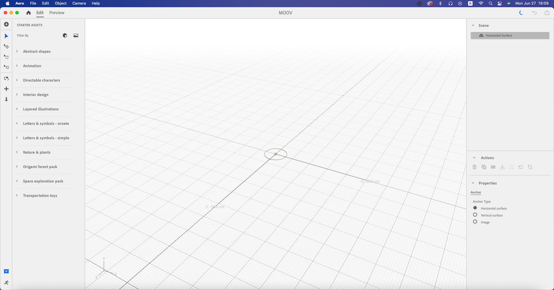
Adobe Aero's UI

Spark AR's UI
Testing the Concept within Time Constraint
Since there was time constraint in the development process, I decided to use a feasible level of mockup to overcome the problem and to deliver the design plan on time.
Using edited video with pictograms as if they were developed in AR environment.

Feasibility Test
Using low fidelity prototype to test users’ understanding of pictograms and how they will move their bodies towards the designated directions.
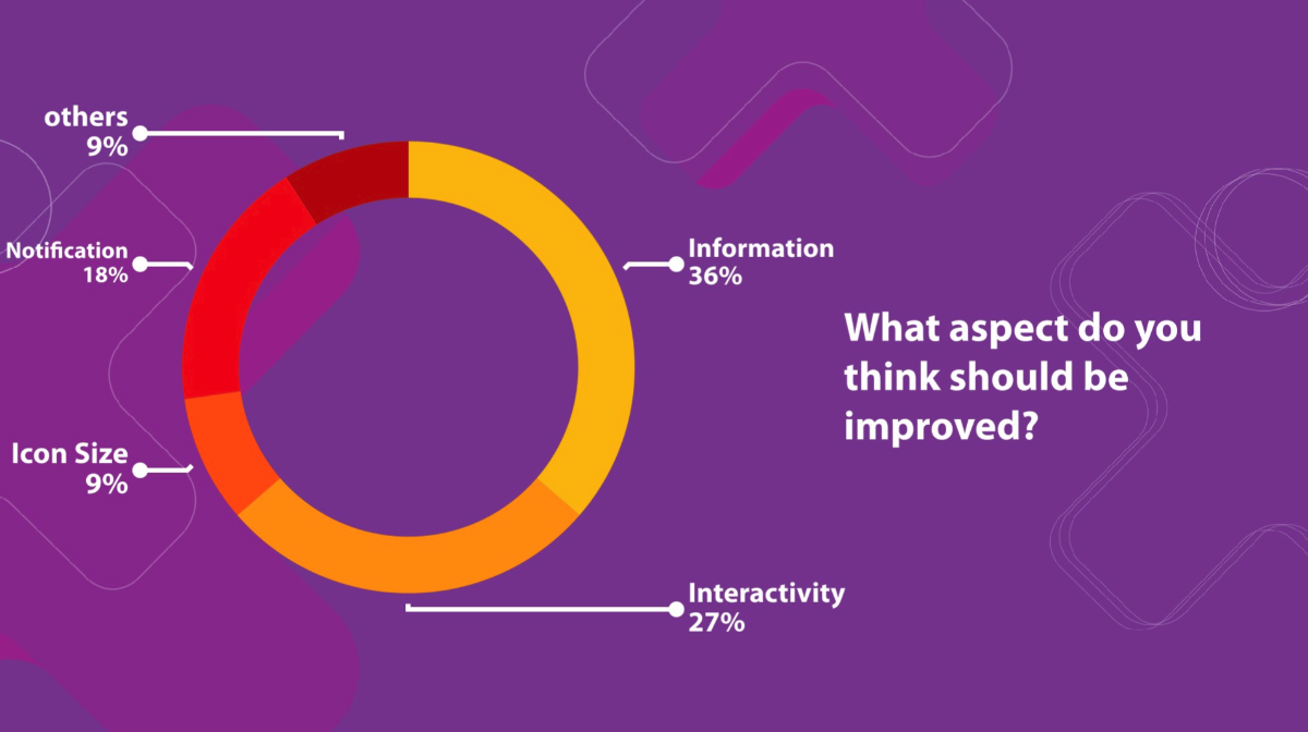
User Test Result
Using pictograms without additional information is not sufficient for users. Therefore, adding text is necessary although it is only serves as a supplementary aspect.
Testing with minimum feasibility level can’t provide maximum interactivity as planned, thus, developing high fidelity prototype using Figma and Unity should be done to get a maximum performance result.
